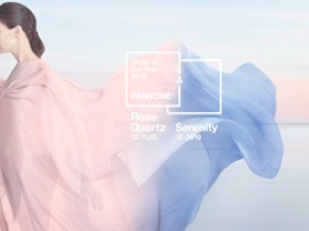
 Double thumbs up endorsement go to Pantone for picking two colours; colours that go together and; two colours that are make a bold statement in spite of their low saturation. That’s a big order for any colour!
Ethereal, quietly joyful, sunny, sweet, feminine, flowy. Just some of the adjectives I think of when I see that image
I have always, always, always loved faded denim with baby pink tops. So this is an easy first outfit. Next, I keep seeing a minimalist coat in Rose Quartz with some Serentiy colour blocked sleeves, with a matching Serenity pencil skirt. Blue tapered dress pants with a ….
‘kay, gotta go now… i have to draw …
k : )
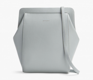 The Fall 2015 Matt and Nat collection is now available at the store. I love this line for many reasons:
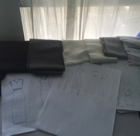 I had lost touch with drawing over the last few years. So it was pretty nice to sit down at the drawing table, with fabric swatches and actually draw with a line in mind. Three and a half years of retail in Kitsilano has given me some insight into your fashion requirements. Together we have discussed the hits and the misses, the holes and floods, the fits and the misfits. Thank you for taking the time to discuss what you like and dislike, it helps immensely.